Archive

Tag Archives: illustration

BakewellSoap_by_DzineMafia_Group

Experiment #6

Gift shops and garden centres seem to be a place where both ends of the packaging design spectrum can easily be found. From the badly designed labels, wraps and cartons of the small cottage industry working to a virtually non-existent design budget, to the beautiful, original and unique packaging of the more design savvy brands. The idea for the latest experiment was discovered whilst browsing one of these gift shops at Poole’s Cavern in Buxton, Derbyshire.

The Bakewell Soap Company

A range of soaps and balms nicely displayed in little wicker baskets caught my eye as a range with a lot of design potential. The Bakewell Soap Company make handmade soaps in an old Victorian mill near Bakewell, Derbyshire where they are supplied to gift shops, for guest houses or sold in wholesale.

The products, beautifully coloured blocks of soap specially blended for different skin types, have a luxury gift or personal treat feel to them which should show in their packaging. Sadly the packaging I found didn’t really live up to this. Although the design was adequate, with a consistent approach across the range, it had a very homemade feel in its finish, especially the bad printing of the wrap around label which looked like it had been done on an inkjet at home.

The redesign

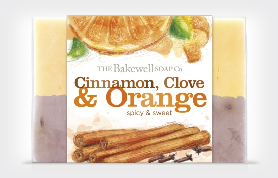
The balance of information on the existing packs didn’t feel right to me. Too much emphasis is put on the old mill logo, leaving little space for the variant type. For the DZINE MAFIA packaging I changed this by designing a new, simpler and more classic logo leaving lots of room for a prominent product title. A slab-serif font works with a handprinted look in two colours and is complimented by bespoke illustrations to create an overall artisan and individual feel, much more inline with the product.

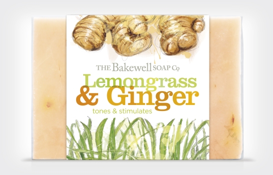
BakewellSoap_by_DzineMafia_Lemongrass_Ginger_Soap

BakewellSoap_by_DzineMafia_Organic_Beer_Nettle_SoapBakewellSoap_by_DzineMafia_Lavender_Poppy_SoapBakewellSoap_by_DzineMafia_Cinnamon_Orange_Soap

The current Bakewell Soap Company packaging

BakewellSoap

Don Simon Smoothie Dzine Mafia

Experiment #4

I see the Don Simon ‘my little smoothie’ cartons pretty much everyday as they seem to be a staple part of my son’s diet. In fact one whole shelf in our kitchen is devoted to them! And although the drink itself is delicious, the packaging leaves a lot to be desired. Ugly typography sits with very bad illustrations and a logo that is inconsistent with other Don Simon products. So this little range of fruit smoothies easily fitted the DZINE MAFIA principle.

The redesign

The basic elements of the packs were there already – logo, product name and fun illustration. The biggest problem was there execution. They just look cheap, unconsidered and rushed, like one of the many pieces of packaging that seem to have bypassed the actual designer.

The DZINE MAFIA redesign retains the fun feel, but with interesting and friendly typography, beautiful illustrations with bags more character and secondary copy with more personality. Plus the correct brand logo.

The result

The final design creates a colourful and cute range of drinks, directly aimed at kids with characters they can easily associate with, whilst keeping enough information for mum’s through the little fruit icons and ‘1 of your 5 a day’ text. Ultimately I think i’ve created something that I’d be proud of my son slurping out of.

Don Simon Tropical Smoothie Dzine MafiaDon Simon Fruity Smoothie Dzine MafiaDon Simon Berry Smoothie Dzine Mafia

The current Don Simon My Little Smoothie range.

Don Simon Smoothies